Frequently Asked Questions
Background

The CRE is for use by individuals, like residents of a neighborhood included in the CRE, and also institutions, like nonprofits, public agencies, and neighborhood associations.
About the Data
The Community Resource Explorer (CRE) is this newly-built website to house neighborhood-level data related to resource allocation and quality of life in Dallas. The Community Resource Index (CRI) is a statistical approach that summarizes a collection of data—in this case, neighborhood indicators—into one value for comparison. Every school included in the Explorer has six different index values: one each for Economics, Education, Family, Community, and Health, and one overall index value that represents a combination of all five categories.
Data featured in the CRE from from a variety of public sources, such as the U.S. Census Bureau, the Dallas Independent School District, and the Centers for Disease Control & Prevention. A few data points were acquired from third-party data vendors (spending on fresh fruits and vegetables) or collected by CPAL (e.g., supermarkets and grocery stores, community health clinics). To learn more about the data used for this project, visit the Get the Data page.
To determine which indicators to include, we looked for (1) indicators that have an impact on the quality of life for kids and their families, (2) indicators that have reliable, current data that can be mapped within a two-mile radius, and (3) indicators that can be acted upon by individuals and institutions. We also studied similar data projects, such as the Dallas Equity Indicators, in consideration of what to cover in the CRE.
The CRI was calculated by aggregating or summarizing data related to five key categories (Community, Economics, Education, Family, and Health) for the geography within two miles of every neighborhood elementary, middle, and high school campus in Dallas ISD. Data related to each of the five categories were analyzed separately and combined into indices to help identify relative differences in resource allocation - i.e., where there are an abundance of resources and where there fewer resources that are related to student outcomes and community-level quality of life. The five scores were then combined into an overall CRI score. If you want to learn more about how we calculated the CRI, you can read the read our Methodology paper.
The map view shows all 189 school communities included in the Explorer, color-coded to illustrate each community’s overall Community Resource Index (CRI) value.
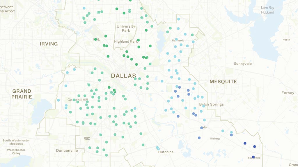
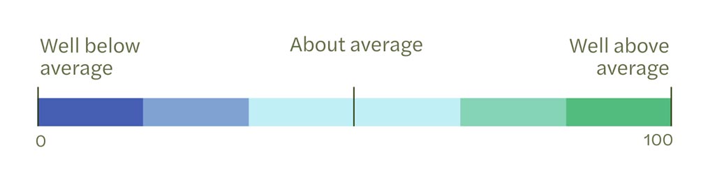
Communities in green have CRI values that are well above average, communities in purple/blue have CRI values that are well below average, and communities in aqua have CRI values that are about average. CRI values range from 0 to 100; values closer to 100 indicate more resources than values closer to 0.
You can zoom in on the map to see a smaller geographic footprint. You can also turn on layers to see the historical redlining map, feeder pattern attendance boundaries, and the racial and ethnic demographics across the city.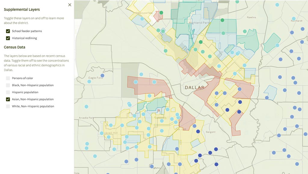
In the map view, you can see data for each sub-index category (Economics, Education, Family, Community, Health) and individual indicators as well—turn these on by clicking on the “Metrics” button on the left-hand side of the window. For each sub-index category and each indicator, the color-coding pattern is the same: communities in green always represent the above average condition, and communities in purple/blue always represent the below average condition. If you’re interested in analyzing a smaller subset of campuses, you can adjust the map display by selecting a category or indicator and selecting a piece of the distribution to display. For example, for Median Household Income, you can select the far right (dark green) square on the distribution, and only the campus communities with well above average Median Household Income will appear on the map.
Every profile also includes the community’s overall Community Resource Index (CRI) value, representing all the indicators taken together and illustrating how well-resourced the community is relative to the other campus communities, as well as five sub-index categories, one each for Economics, Education, Family, Community, and Health. Each category includes (1) an index value, representing all the indicators included in the category and illustrating how well-resourced the community is relative to the other campus communities in that particular category and (2) a series of indicators that provide both raw data about the community as well as where the community falls in the distribution of all communities on each indicator. For example, the sample indicator below, Total Jobs, tells us:
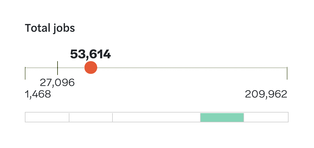
- The range of Total Jobs across all campus communities. The minimum (lowest) is 1,468. The maximum (highest) is 209,962.
- The mean, or average, of Total Jobs across all campus communities. Marked by a tick mark (vertical line), the mean number of jobs is 27,096. For most indicators, the tick mark for the mean will be about halfway between the min and the max (i.e., near the centerpoint of the line). For some indicators, like Total Jobs, the tick mark might be further left or right, indicating skew in the data. In this case, Total Jobs skews left—209,962 is an outlier.
- The actual number of Total Jobs for this particular school community. Marked by a red dot, the actual number of jobs within the two-mile radius around this school is 53,614.
- Where this school community falls in the distribution of all school communities in Total Jobs. This is represented by the rectangular bar beneath the thin line. Highlighted in light green, this school community is slightly above average in the number of jobs. If the bar were highlighted dark green on the far right end of the distribution, the school community would be well above average in the number of jobs. If the bar were highlighted aqua blue in the center of the distribution, the school community would be about average in the number of jobs. If the bar were highlighted light purple/blue to the left of center, the school community would be slightly below average. If the bar were highlighted dark purple/blue to the far left of center, the school community would be well below average. The distribution approximates a normal distribution, meaning a bell curve where most school communities fall in the center/about average and fewer are slightly or well above/below average.
- We added new data, such as the percentage of households that have access to broadband services and the number of community health clinics within each two-mile area. Check the Get the Data page to learn more about all of the data that is featured in the Community Resource Explorer.
- The calculations for each of the five subindices (Community, Economics, Education, Family, and Health) as well as the overall Community Resource Index were improved to help overcounting indicators that are highly related (such as percentage of low-wage jobs and median household income). We did this by using Principal Components Analysis to group and weight subsets of data for each subindex, as well as by removing indicators like doctor’s offices that made it harder to produce meaningful data for each two-mile area. We also adjusted for population density.
- The Community Resource Explorer makes it easier to understand the data that drives the CRI. We worked to make an interface that is easier to navigate, that allows for more interaction with the different datasets, and that hopefully doesn’t have too many glitches.
- You can now export PDF reports that include the data for all elements of the CRI for any one campus community in Dallas ISD. To do so, click on a school within the Explorer to view its full report, then click “Export PDF” to download.
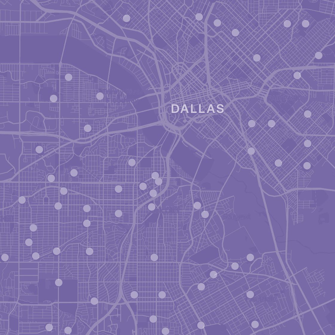
The data associated with a particular neighborhood covers a two-mile radius (or four-mile diameter, with the school at the center), which is a pretty big geographic footprint. When people think of their neighborhood, they might think quite small - perhaps just the homes and school nearest to them. Other people might think quite large—perhaps all of Oak Cliff or East Dallas. How you imagine the boundary lines of your neighborhood will shape how you perceive the data. Additionally, schools that sit on the edge of Downtown Dallas/other major business hubs or on the edge of the Medical District/other major healthcare hubs will capture a volume of data that might far surpass what a resident notices and can access in his/her immediate vicinity. For example, the two-mile radius around a school in South Dallas/Fair Park will capture some parts of Downtown Dallas, including businesses and jobs that are not necessarily representative of what exists right around the feeder pattern schools. Finally, the majority of data included in the CRE come from publicly-available databases. Sometimes, those databases might code certain data elements (like a health clinic) differently than we would. We are continuing to work to “clean” the data to ensure that it reflects the lived experiences of residents as closely as possible.
Use of the CRE
- Residential areas highlighted in red (labeled “hazardous”) were typically home to Black residents, older housing, and poorer households;
- Areas in yellow (labeled “definitely declining”) were also usually home to majority people of color;
- Areas in blue (labeled “still desirable”) were usually home to majority working-class white residents;
- Areas in green (labeled “best”) were usually home to professional class white residents.
Next Steps
We plan to continue adding to the CRE over time and are eager to list the many assets of Dallas neighborhoods that might not be currently reflected. To that end, please share insight about your neighborhood by completing the form here.
Feel free to email Ashley Flores, Senior Director at the Child Poverty Action Lab, at ashley@childpovertyactionlab.org.
Sign up using the form here to receive future news about the CRE.